
Designing the Feedback System for AI Summaries at Sprinklr
Gave agents a way to respond to summaries and help improve Sprinklr’s AI, making it easier to trust and use summaries during case handling.
In just two weeks, I designed a feedback system that made Smart Summaries easier to trust and easier to improve. The solution helped agents respond faster and gave Sprinklr’s AI smarter data to learn from.
❌ The Problem
|
✅ The Solution
An intuitive UI for thumbs up/down, structured feedback, and peer votes. |
📈 The Outcome
Faster responses, stronger trust in summaries, and smarter AI training data.
Overview
Sprinklr is a customer experience platform that helps companies manage interactions across digital channels.
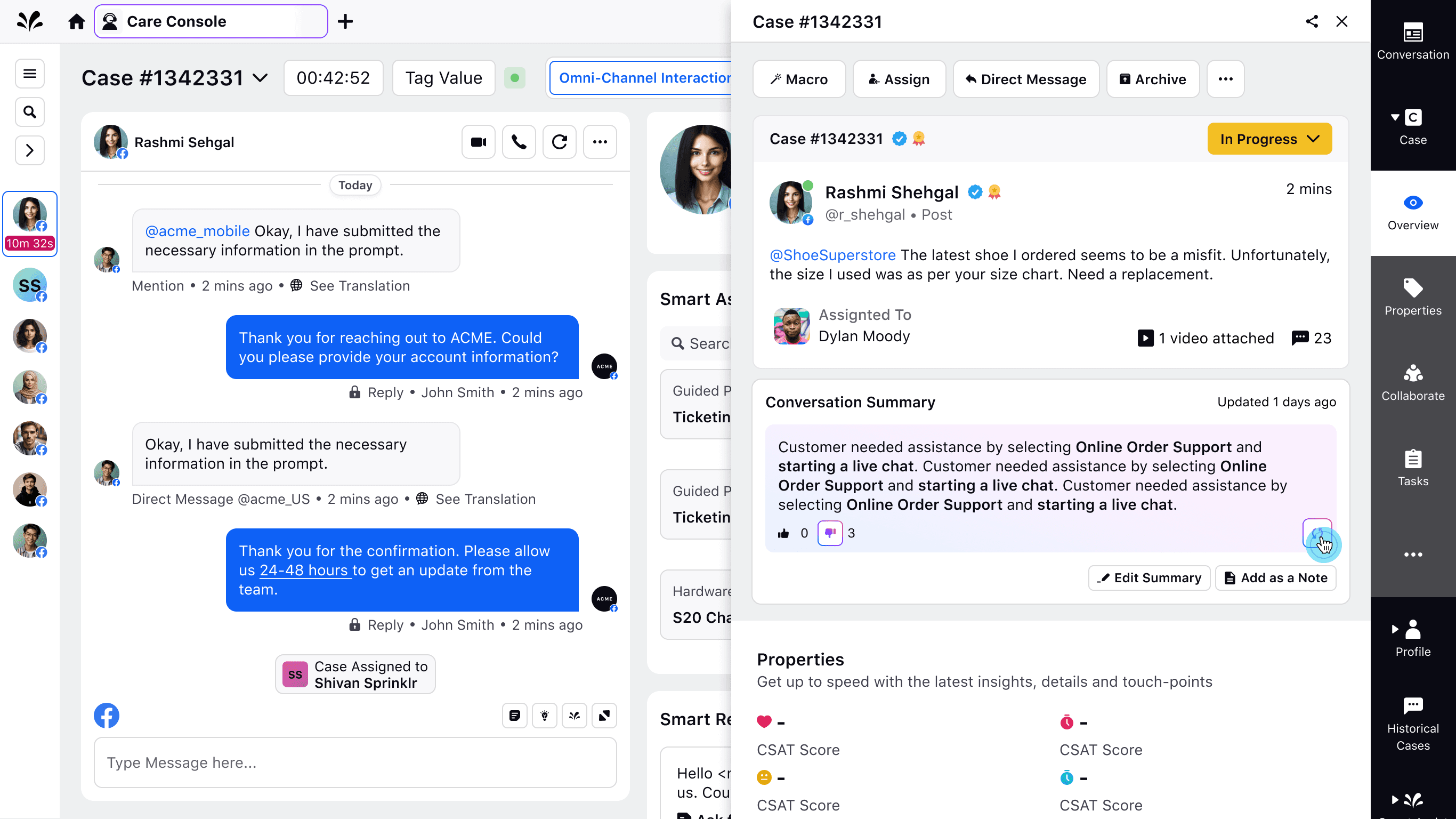
As part of Sprinklr Service, the Care Console is a unified workspace where care agents handle conversations, resolve tickets, and track case history efficiently.
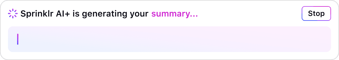
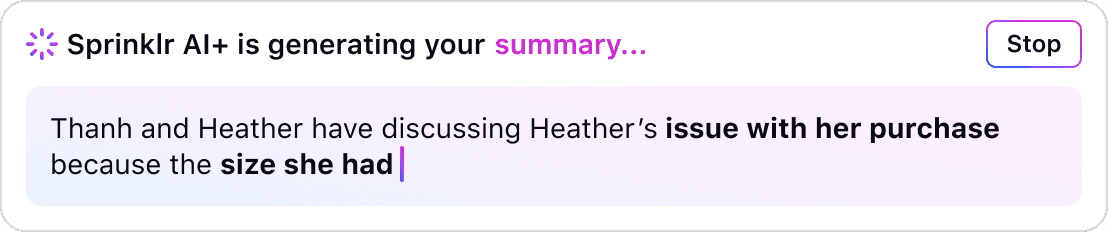
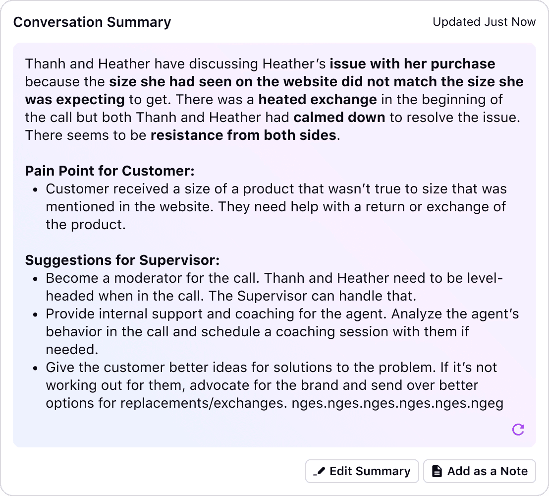
To help agents work more efficiently, Sprinklr introduced AI-powered Smart Summaries, a feature agents can click to create a summary of case history, making it faster to understand past interactions without reading full transcripts.

The Problem
Agents had no way to respond to these summaries—no way to flag issues or confirm when a summary was helpful. As a result:
❌ Agents found it harder to trust the AI-generated content
❌ They spent more time verifying information themselves
❌ The AI had no feedback signals to learn and improve from
The Solution at a Glance
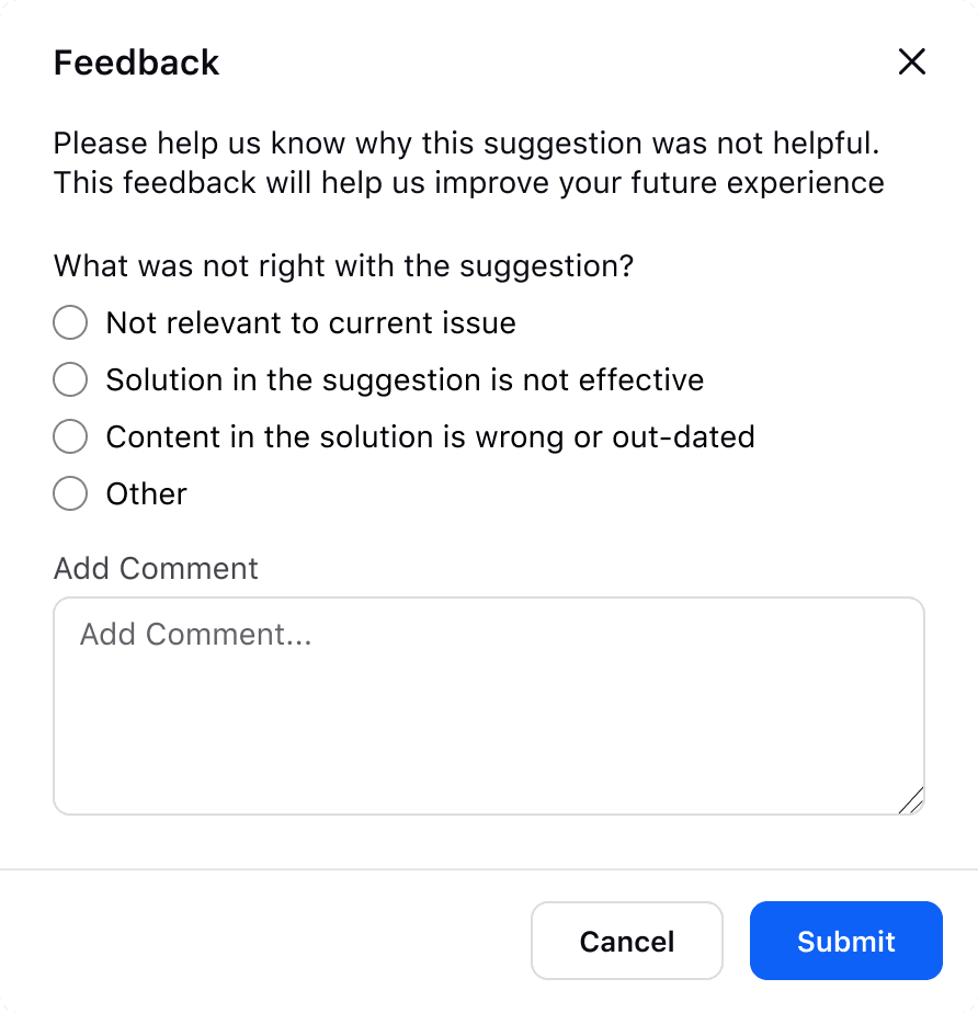
I designed a simple, intuitive way for agents to leave a Like or Dislike on Smart Summaries, explain why a summary wasn’t helpful, and see how others had responded. This helped agents work faster and gave the AI better signals to learn from.

My Role
I was the sole designer responsible for turning four loosely defined use cases into a fully designed feature. My job was to clarify what the UI should do, explore how it should work, and deliver developer-ready designs — all while aligning with existing platform patterns and sprint timelines.
Clarifying What to Design
Used research-backed user stories to guide design solutions for Smart Summary feedback
Before the sprint began, the UX Researcher and PM shared four user stories outlining what agents needed and why current solutions weren’t working. These stories defined the problem and user needs. I was responsible for turning these needs into clear, intuitive designs that fit within the product.
Agent tasks that need design
Based on the user stories, these were the key tasks the design needed to support:
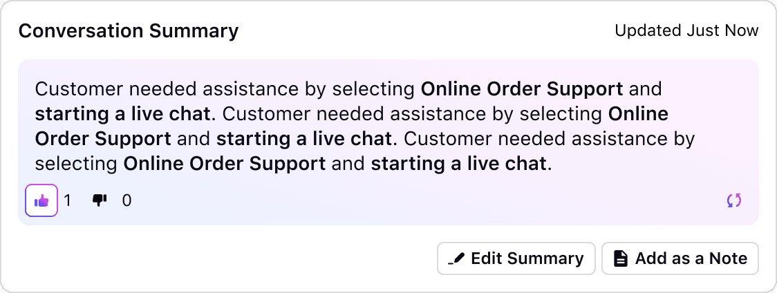
👍 Positive Feedback
Give positive feedback on accurate and helpful summaries
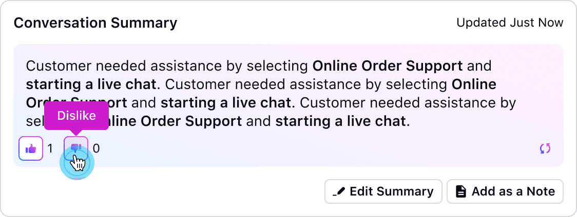
👎 Negative Feedback
Give negative feedback on unhelpful summaries
➕ Feedback Counter
See a vote count when clicking
Like/Dislike/Regenerate a summary
📝 Structured Feedback
Open a modal to give a reason when submitting negative feedback
The design ticket helped visualize each user story alongside its pain points and requirements—clarifying which features I needed to design and why.

What I prioritized when designing the solution:
Easy to use during live case handling
Reused approved components when possible
Followed Sprinklr’s design system and UI patterns
Matched latest design patterns for Sprinklr AI
Finding Patterns to Build From
Leveraged existing components to maintain consistency and reduce development effort
Before exploring design solutions, I reviewed Sprinklr’s Hyperspace Design System, internal design files, and checked with teammates about any recently approved examples not yet in the library. I was looking for existing patterns—like voting, feedback, or modals—I could reuse or adapt to stay consistent and reduce dev effort, while identifying areas where new designs were needed.
Reusing patterns helped me:
Keep the design consistent with Sprinklr’s platform and AI patterns
Move faster by using approved components as references
Avoid extra work for engineering
Validate ideas using real, working examples
Key Insights from reviewing design system and files
Like/Dislike icons existed but weren’t used in this specific context
No patterns for vote counts or structured feedback tied to AI
Modal patterns existed but needed updates for feedback input


Exploring Design Directions
Shared early design options to get fast feedback
and align on the right direction
Since the requirements were clear and I was building on existing components, I skipped low-fidelity wireframes and jumped straight into high-fidelity explorations to make the most of the sprint timeline.
I created 2–3 design options for each user story using reusable components and patterns. These were shared with peers and the Principal Designer by the second day of the sprint to gather early feedback.
The goal was to quickly align on a single direction to guide the rest of the sprint.
I explored multiple ways to handle feedback interactions, including:
Where to place the Like/Dislike buttons for quick input
How to display vote counts clearly and unobtrusively
When and how to capture structured feedback using a modal or popup

Final direction aligned on during review:
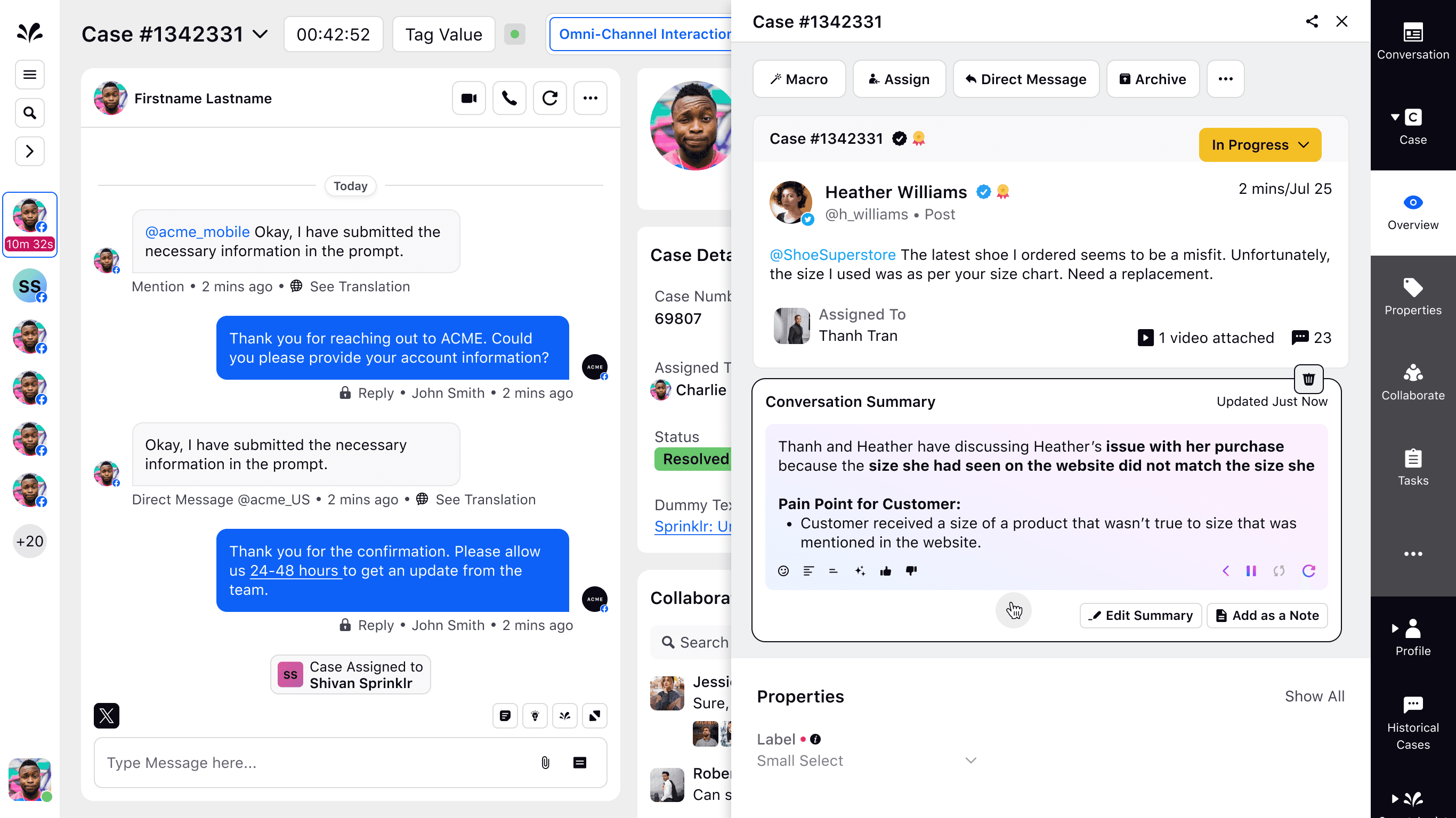
Placed Like/Dislike buttons on the left, matching other AI widgets
Displayed vote counts without outlines to keep the UI clean
Moved the regenerate option to a secondary location to reduce clutter
Used a light-box modal for negative feedback — triggered after a Dislike, with reason selection and optional comments
Ensured all actions could be taken directly from the summary component


Finalizing the Full Design
Used the approved direction to define final flows
and unblock development
Once we aligned on a design direction, I walked through the solution with PM and Dev to ensure it met the business needs and was technically feasible. This gave the team a chance to raise concerns, clarify edge cases, and begin laying the engineering foundation in parallel with design refinement.
I then completed the full user flows and interaction details for each user story and shared them with the Principal Designer for review. While waiting on feedback, I kept PM and Dev in the loop so we could proactively catch issues early.
After a few rounds of iteration, the Principal Designer approved the flows, and Dev confirmed they were ready to begin final implementation.

QA & Implementation
Once engineering began development, I reviewed early builds and ran QA to make sure the final implementation matched the approved designs. I:
Created a QA checklist based on the final designs
Identified any visual or interaction gaps in the implementation
Flagged fixes for engineers before the feature shipped
Impact & Reflection
This system helped agents respond faster, trust summaries more, and train the AI over time. While I wasn’t able to capture success metrics due to my departure, the feature was prioritized for rollout to key partners and became the foundation for future AI feedback tools.


How My Design Improved the Experience
✔️
Enabled agents to provide structured feedback, improving AI accuracy.
✔️
Built transparency into AI-generated summaries, increasing trust.
✔️
Replaced inefficient manual feedback methods with an integrated, scalable solution.
✔️
Ensured seamless implementation by leveraging existing UI patterns.
Lessons Learned
✔️
Aligning early with stakeholders minimizes rework and accelerates development.
✔️
Reusing design patterns ensures consistency and reduces complexity.
✔️
A clear, structured feedback loop is essential for building trust in AI and driving continuous improvement.