Logic Design System
Visual design system for Molecula, a real-time analytical database built on bitmaps.

Overview
Project Background
Molecula’s cloud product takes users’ data and creates a feature-first format and transforms it into a real-time database that enables organizations to unlock the power of real-time data analytics for AI applications.
Objective
Collaborate with the other product designer to build their first design system that will be an integral to bring the product and user experience to life. We need to help users understand their complex data with our cloud product and enables our team to quickly compose elegant and consistent designs quickly with well-tested, reusable components and reduce production time.
Challenge
When I joined the company, the user-interface did not exist and the product lacked a design system. Only users familiar with code and API’s were able to use the product. We wanted to grow the business as a young startup by making it more accessible to a larger audience and improving the user experience.
An important part of creating a new user experience is having a solid design system in place that would serve as a foundation the design language, enables teams to rapidly design new features and quickly deliver them to users while also continuing to establish a unique visual system as the product grows and develops.
My Role
As one of the two product designers on the team, I was responsible for the visual designs system, creative direction, and providing code for the visual theme.
I conducted design audits, competitor research, comparative analysis, design proposals, UI design, observed usability testing, collaborated with product and engineering team, specifications for handoff, coded a custom theme using Google’s MUIThemeProvider, and paired with brand marketing on the core visual identity.
Date & Duration
Company/In-House
Role
UI/UX Design
Design Audit
Stakeholders Meeting
Ideating Solution
Code custom theme
QA Implementation
Date & Duration
UI/UX Design
Design Audit
Tools Used
Figma
Adobe Illustrator
Zeplin
VS Code
The Process
Research & Audit
Analyze Findings

Proposal & Iteration
Implementation

Research
Conducted internal audit
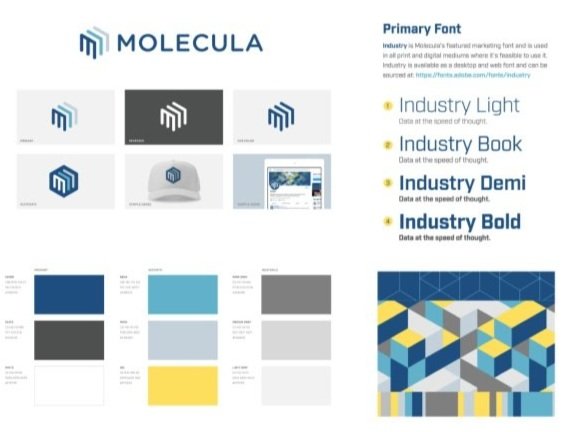
I first started with the brand audit and gathered all visual elements that work together to form the brand identity and how it’s used throughout the entirety of the brand experience on the marketing website and creatives. Color palettes, typography, graphics, branding, illustrations are consideration points to help us create new experiences while still maintaining the consistency in the brand experience for anything new we create.
Understanding the brand identity gave me more creative insight as I started the UI audit, which helped me establish an inventory of all the screens, controls, components, and variations while also allowing us to understand what’s being used and not being used and how.
I then reviewed the current research on our users and met with the executive team to understand what their vision of the end goal is so I can understand the expectations that need to be met.


Key Takeaways
The audit gave me a holistic idea of what the new design system will be working with and helped guide my research and creative exploration for new ideas and solutions.
Established core design to keep it consistent with the current brand (Color Palette, Typography, Identity)
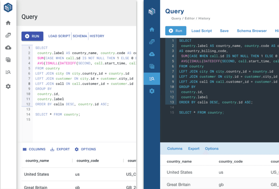
Instead of starting from scratch, we already have screens and controls using Material UI kit as a starting point. As a growing startup with limited resources and tight timeframes, this will allow us to quickly create a baseline for our design system.
Did a comparative analysis of competitors and design systems
I researched what makes up a design system and how it’s intended to work. What does a successful one look like? Set targets to work towards based on what we learned from the internal audit. I looked at our competitors in the space to understand what industry best practices are and paid close attention for opportunities to improve.
I also observed designs from companies in the productivity and project management space for new ideas that could also help our solution and create a unique experience.
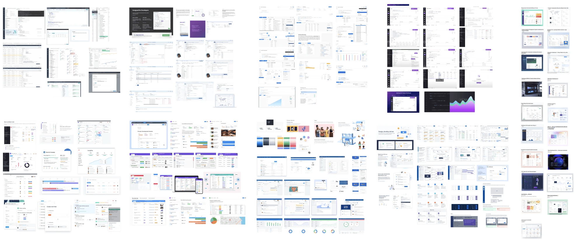
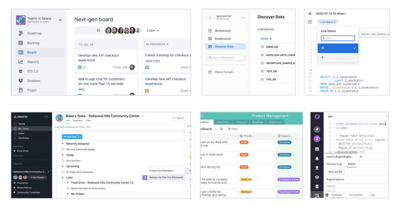
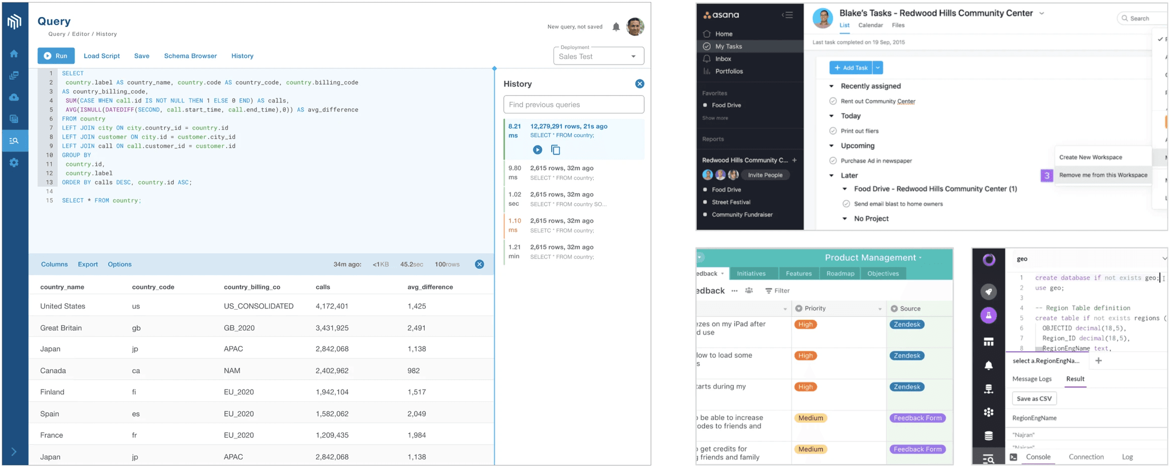
Productivity Space
Design Influencers
Key Insights
What was needed to complete our design system
A holistic idea of competitor designs and how they go about helping their users
Looked at indirect competitors with well known design systems, particularly products that enabled users to work with a vast amount of information at once
Collected valuable research that can help us dream up with potential design concepts or creative solutions
Analyze Findings
Making sense of my findings
Narrowed down my findings to reveal the strongest design concepts that will help us start building our design system. I sorted my findings into an affinity map and organized similar designs into groups to identify the differences in design concepts and solutions.
Next-Steps:
Came up with 2 proposals for our design system
The contrast between the 2 proposals was important in order to gain valuable feedback on the creative visual direction
Ideate & Iterate
Visual Concept Proposals
Presented our research and 2 design proposals for the design system with the executive team.
Mocked up visual examples of each proposal along with a breakdown of the pro’s and con’s for each creative direction
Proposal #1

Proposal #2
Key Takeaways
Based on the experience and industry knowledge of the executive team, they felt Proposal #2 was the strongest and had the best potential for their vision and business goal. We received insightful feedback from both proposals and learned what designs resonated with them.
Feedback and Iteration
I revised the design proposal and expanded on the design concept by including mockups for screen variations showcasing the impact of the design system. After approvals, we had a clear design system to start working towards.
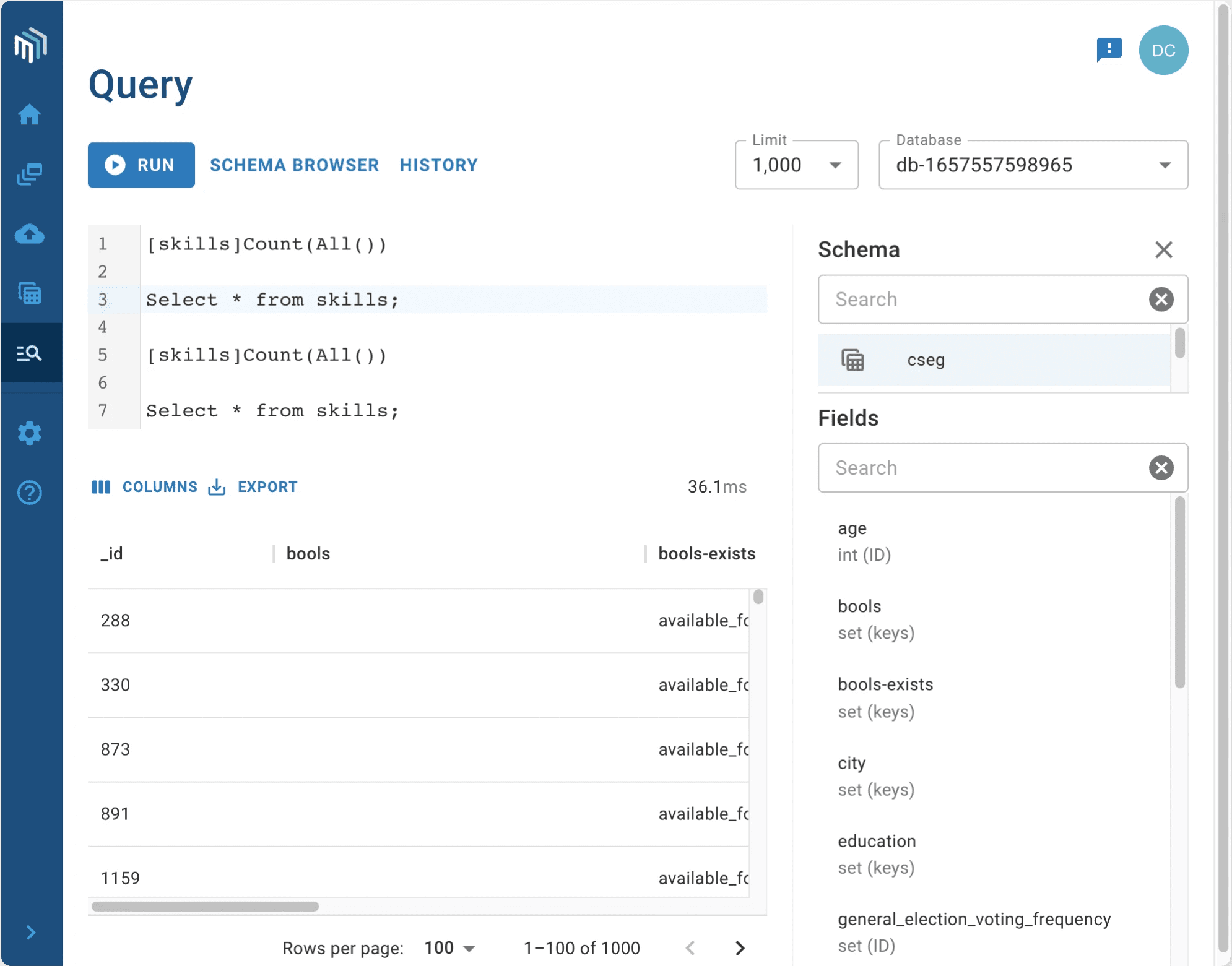
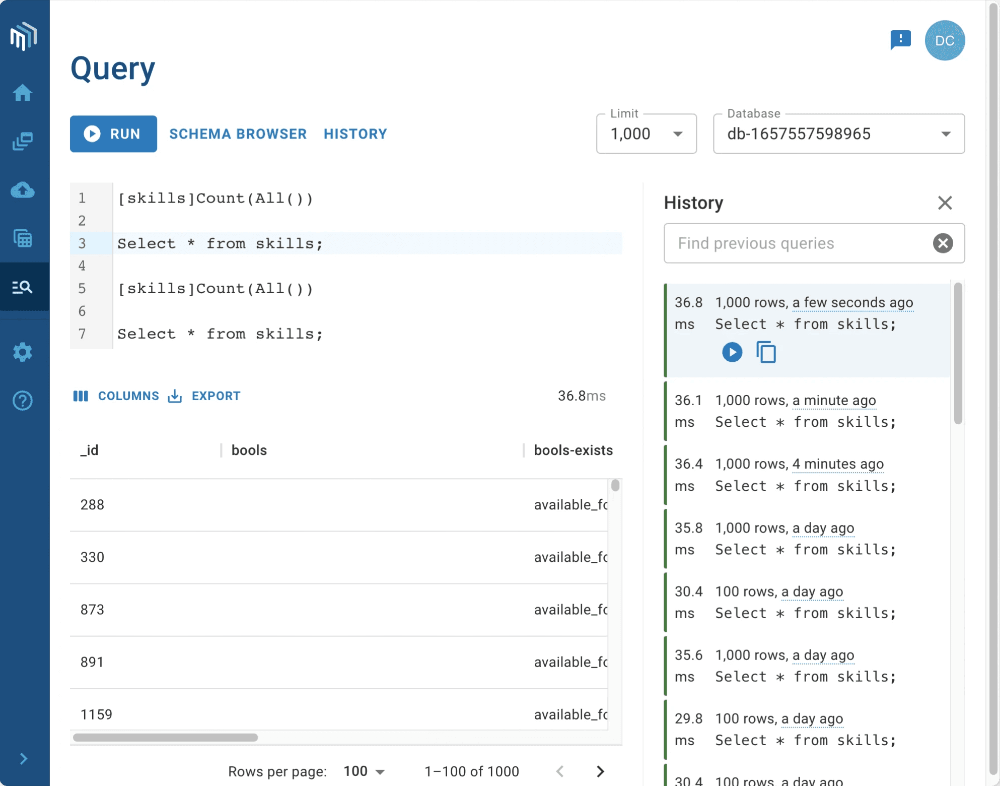
Implementation
Started building the design patterns and breakdown the specs
As mentioned earlier, we utilized Google’s Material UI toolkit to quickly create a baseline for our design system and continue to build as we go. We continued to create screens and features as we worked towards creating a theme that we can inject.
We made changes to current and new in-coming designs to align closer to the design principles that we were aiming to instill in our system.
When screen designs and variations were finished, we included designer notes describing how things worked and collaborated with product managers and developers for any necessary changes to meet requirements.
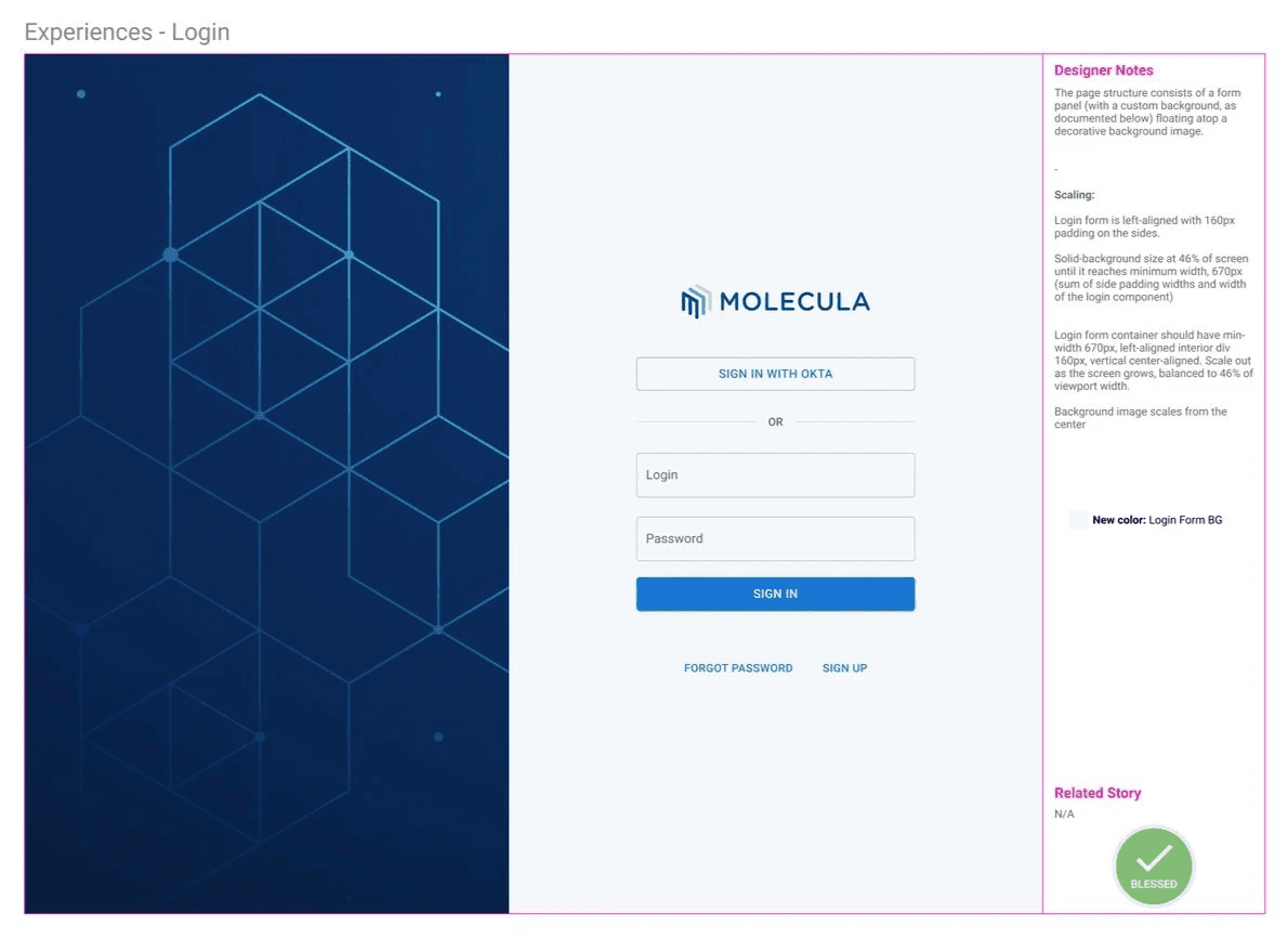
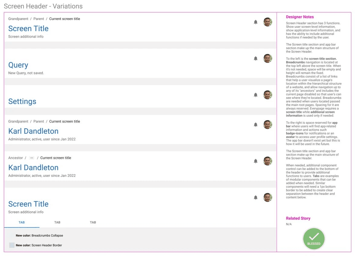
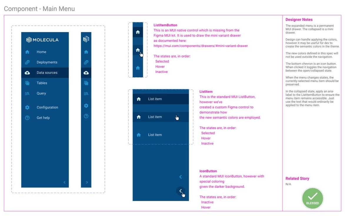
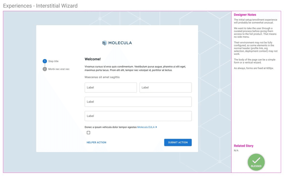
Designer Notes Include:
Breakdown of specifications
Description of how it’s intended to work and help the users
Conceptual instructions on how the design works
- Kept track of designs that needed to be reviewed or have been blessed for production
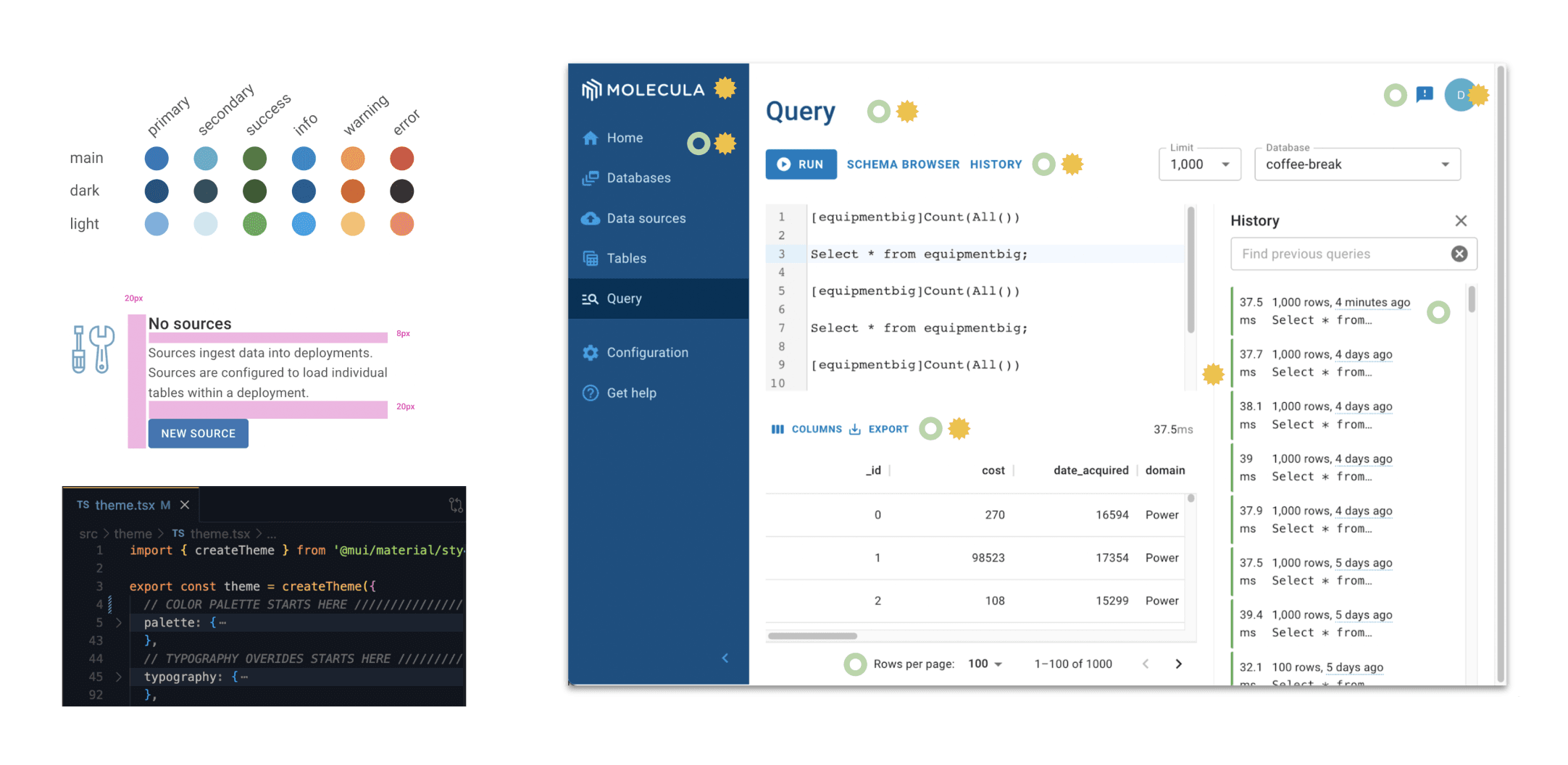
Provided code for custom theming
I provided code to the React theme file which enables us to change the color palette, typography, and make style overrides to components, the core of the visual design system. Theming has its limits so we collaborated with dev for more complex changes outside of the React theme provider and documented all changes needed.
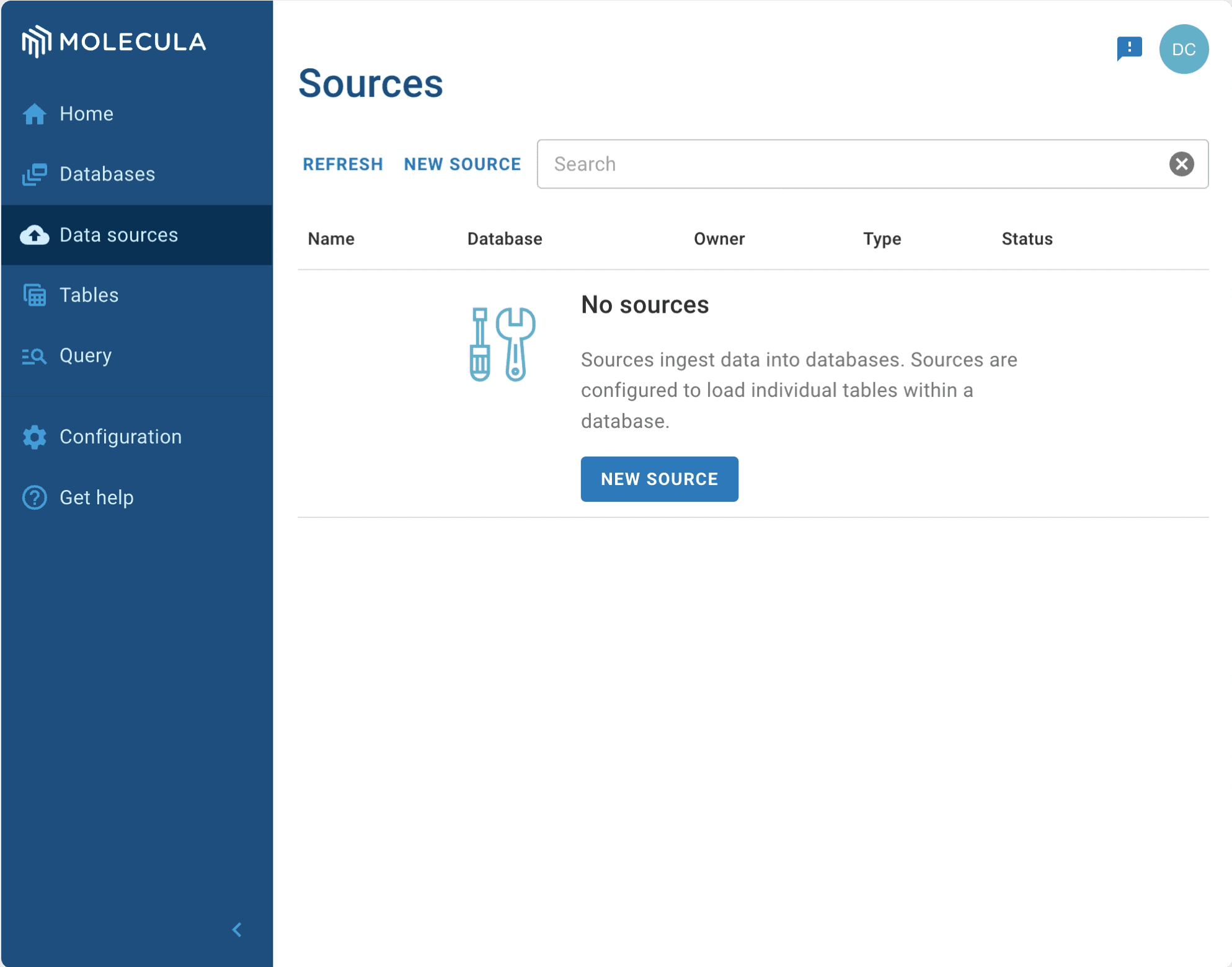
Final Design
Core design elements that promote hierarchy of information, legibility, and meets accessibility standards
Component sets and variations that are reusable and allow for rapid design and iteration
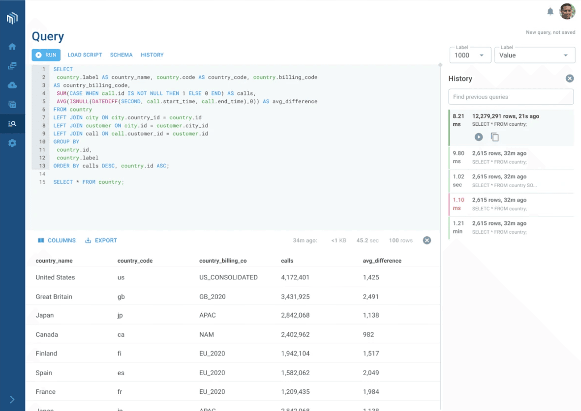
Design pattern that enables users to reason and understand their complex data
A unique visual identity that gives the product a refined maturity and fits alongside with our competitors in the data space.
- Kept track of designs that needed to be reviewed or have been blessed for production
Consistent layout of content with an intuitive user flow